money supply
Track over six decades of money supply expansion and its implications for inflation, purchasing power, and economic stability. From historical trends to the sharp increases of recent years, see how the Federal Reserve’s policies have shaped the real money stock.
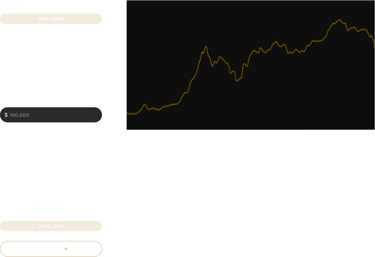
The chart above, titled “Real M2 Money Stock,” provides a historical view of the U.S. money supply, adjusted for inflation to reflect the true purchasing power of dollars in circulation. Simply put, the M2 Money Stock includes all cash, checking deposits, savings accounts, and easily accessible investments in the economy. The “real” adjustment accounts for inflation, giving a clearer picture of how much money is effectively available to consumers and businesses over time.
Since the Federal Reserve began tracking this data in 1959, the chart allows you to select any start and end date to measure how the money supply has grown. By default, the embedded chart displays the full history from inception to the present, highlighting major trends and events that influenced monetary expansion.
If you'd like to focus on a particular date range, simply click the "Customize" link located in the lower left corner of the chart. This will take you to the original page on the St. Louis Federal Reserve's website, where you can adjust the start and end dates to suit your interests.
One particularly notable moment on the chart is the unprecedented spike during the COVID-19 pandemic. In response to the economic crisis, the Federal Reserve implemented massive stimulus measures, including slashing interest rates, printing money to buy U.S. Treasuries, and injecting liquidity into the financial system. These interventions dramatically expanded the money supply, which contributed to the inflation that consumers have experienced in recent years.
This chart is a powerful visual tool to help you understand how the money supply grows over time and how those changes may influence inflation, purchasing power, and, ultimately, the case for owning physical precious metals.